QS Reimagine Education Conference & Awards
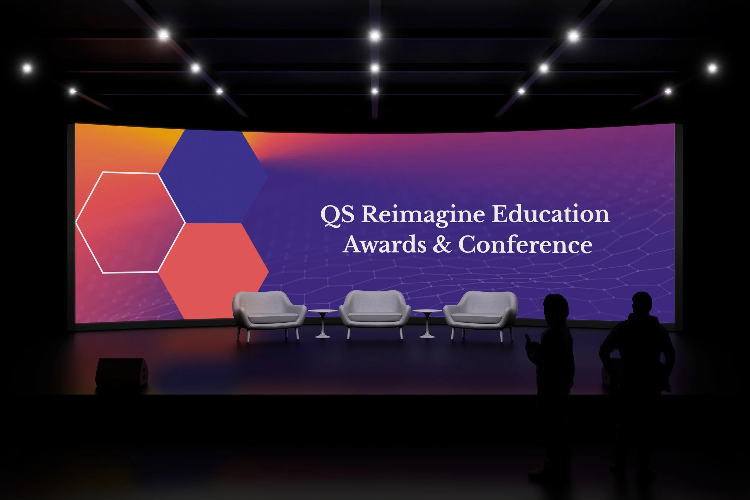
I rebranded one of our QS conferences, Reimagine Education, as the previous identity was outdated and needed a stronger visual link to our other summits, which use geometric shapes and gradients. The conference’s core theme - Never stop innovating - inspired a design built around interlocking hexagons, symbolising community and collaboration, which are central to innovation.
The colour palette conveys both prestige and imagination, while the creativity at the heart of the awards and conference is expressed through experimental compositions. This flexible approach allows us to create varied scenarios across the campaign suite.
To ensure the branding worked in context, I developed visuals for key touchpoints, including badges and stage design (shown below).


